Design
I have been designing professionally since late 2010.
As a creative person this became a new way of expressing myself. I pride myself in being a modern, simplistic designer but I know that every brand with every client is different. Even if I prefer clean layouts I also pride myself in being capable of creating designs that better suit the message the company/client I am working for is trying to convey.
Below you will designs from projects I have worked on throughout my career as a designer. Not all designs are on here due to the wishes of the client. I am skills are as followed, but not limited to: layout design, print design, digital design, brochures, flyers, posters, banners, leaflets, postcards, logo design, website wireframes and design, social media promotions, and more. I continue my education as a designer and hope to one day become an art director.

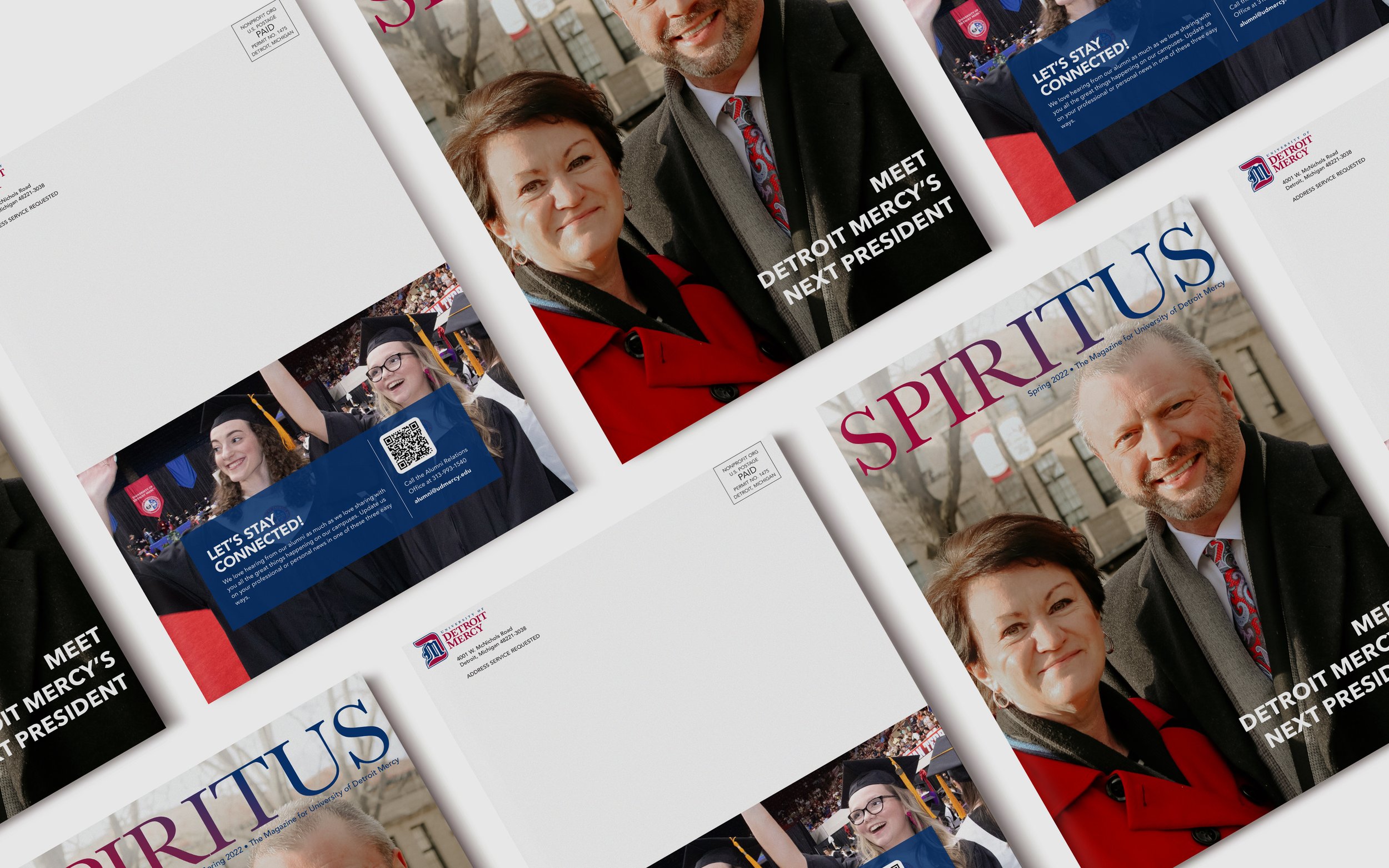
Spiritus, Spring 2022 Issue
The alumni magazine, spring 2022 issue, Spiritus. Cover and back design is shown. Displaying the new president of the university and his wife.

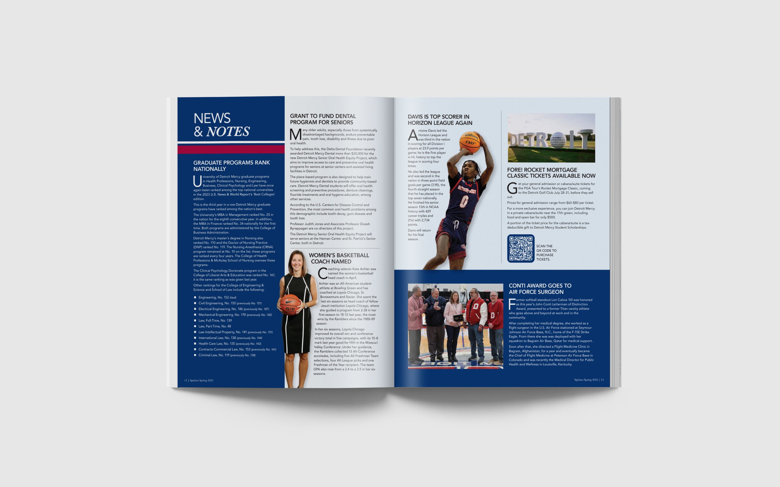
Spiritus - Spring 2022 Issue, inside spread
This spread is of News & Notes. Showcasing our new look for the magazine. A modern look that incorporates our university colors and a new way of including images for each feature.

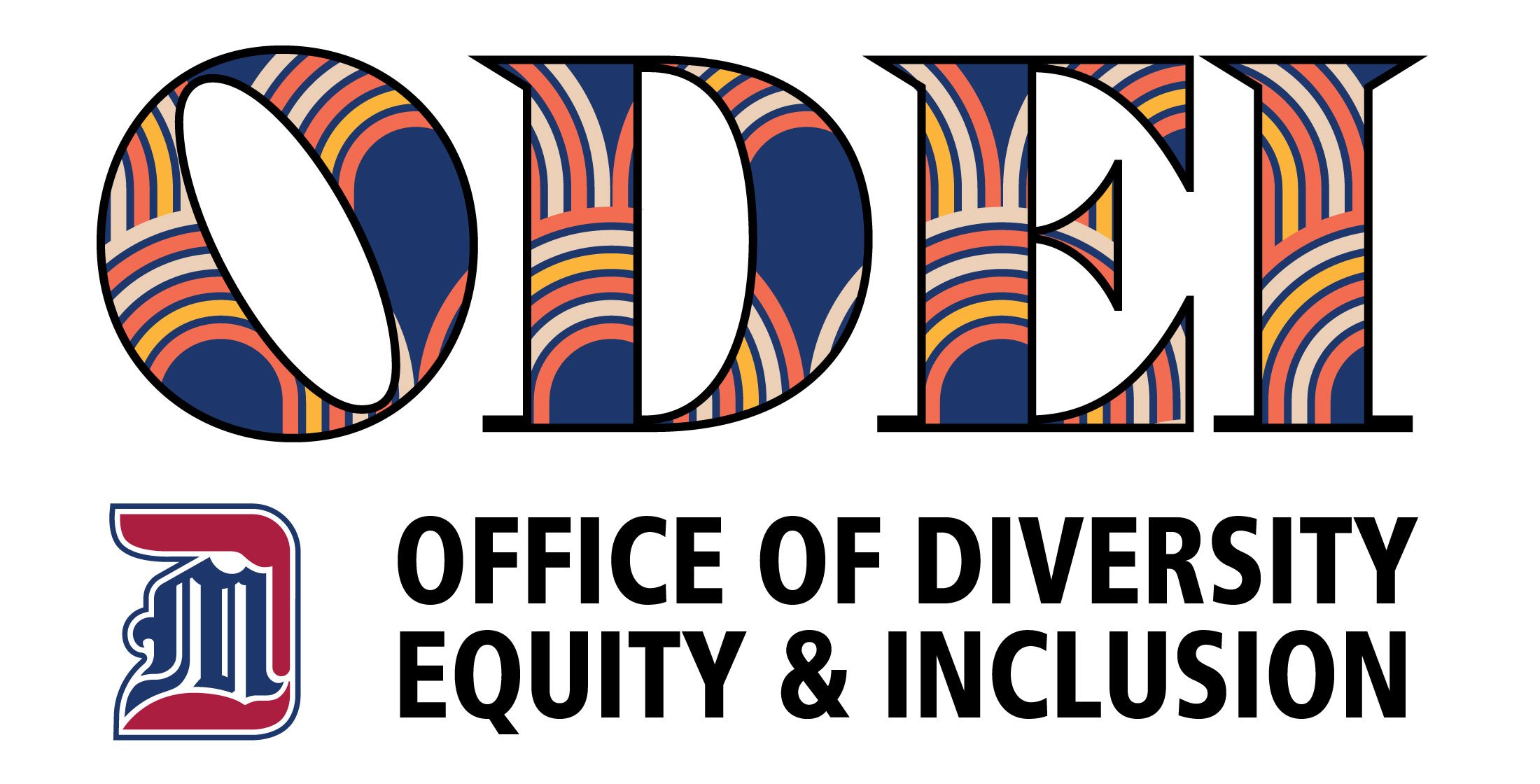
Detroit Mercy's Office of Diversity, Equity & Inclusion Logo
This logo was created with the intent of standing out from our other university-associated logos. It is to represent equality while being diverse. The director of ODEI and I worked closely in creating a logo that was modern but unique.

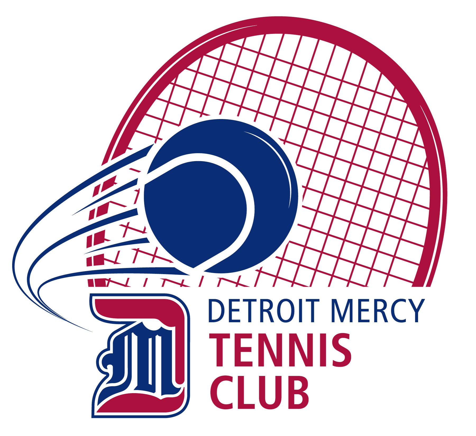
Detroit Mercy's Tennis Club Logo
Created for the student’s sports club, Tennis Club, associated with URec.

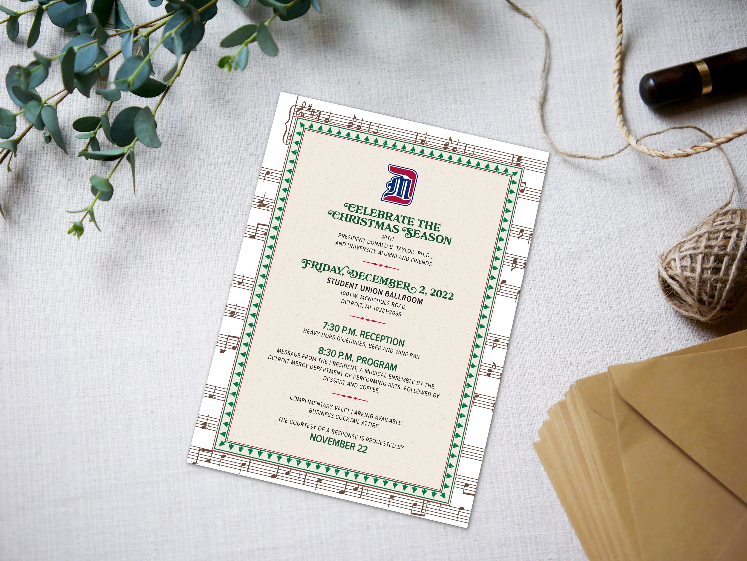
President's Christmas Card
This design is for the President’s Christmas party. The design paid homage to a classic Christmas-style music sheet invitation.

This poster and the postcards below this are one piece. I have been creating the fall retreat posters for my church since 2013 with the exception of 2014 because they decided to use the design of the previous year. With this piece, however, I was given a lot of design freedom. I wanted a color scheme that best represented the feel of their retreat and to be very "fall-like" in feeling. I asked what information they wanted, knowing what they info they provided the years before I felt I was at an advantage for what I could put on the poster. I chose the typeface's, again, I wanted them to be very welcoming and calming. This year there were more younger men attending this retreat in addition to the older men that have gone in the past so the target was to attract the former group mentioned. The poster is 24x36" and three of them were printed, 200 4x6" postcards were printed for individual distribution.

2016 Men's Retreat Hand Outs
These postcard size hand-outs were created with the thought in mind for them to be distributed to members and so they may keep a copy in their Bibles or books.
Programs used: Illustrator and InDesign

MMI DOOR's Paint & Stain Chart
MMI DOOR is undergoing a slight brand change by making layouts more minimalistic and modern to stand out from the competition.
This trifold was created with the customer experience in mind. Images of our products were made to show the customer the paint colors and stain possibilities for their home. Ranging from our clear glass to decorative glass lines - the customer will have unlimited options!
Layout created in InDesign
Images edited and created in Photoshop
Vectors made in Illustrator

Entry Doors Brochure
Redesign, October 2018 to present.
Front cover to MMI DOOR’s Entry Doors brochure redesign.
Photo retouched and door designed in Adobe Photoshop.
Layout created in Adobe InDesign.

Entry Door Brochure
Page Count: 78 (not including back and front covers)
Layout Designed in Adobe InDesign.
Graphics and other product imagery in Adobe Illustrator and Photoshop.
Co-designed with sr. designer, Heather Talcott.

Score a New Door Sweepstakes
Door products created in Adobe Photoshop.
Graphic created in Adobe Illustrator.
Goal: Attract customers to enter our door sweepstakes.

KOPS Logo Design
Designed while at MMI Door to promote awareness to our warehouse employees to keeping our people safe every day.
Collaborated with Kyle Bonar at MMI Door.
Programs Used: Adobe Illustrator

220 Merrill Menu Mockup
Conceptualizing a new menu and cocktail menu mockup for 220 Merrill in Birmingham, MI.
Created with InDesign, Illustrator and Photoshop.
Designs are not associated with 220 Merrill


Witte Property Maintenance Logo Design

As part of their social media campaign, Daisy would request pins made to Pinterest using their photos to advertise recipes and capture the mood of the season.
Programs Used: Adobe Illustrator & InDesign
Image supplied by Daisy.

As part of their social media campaign, Daisy would request pins made to Pinterest using their photos to advertise recipes and capture the mood of the season.
Programs Used: Adobe Illustrator & InDesign
Image supplied by Daisy.

TTM Air, LLC Logo
Created for Terry Milliken’s new business.
Programs Used: Adobe Illustrator

A logo design! This was a collaboration between my brother and I. He's a writer, a brilliant one! He has been writing poetry for a number of years and wanted to have his own brand apart from his personal life. This is why we came together to design the logo for Word. Detroit. The W and the D are from my brother's hand, it is his handwriting and I only did the digitalization and suggesting him colors and a supportive typeface for the "Word. Detroit." beneath the initials. It's a clean design and I'm very proud of what we came up with.

Olay Instagram Take Over.
Worked with lead Content Producer Taylor Larson in assisting with laydown lifestyle shoots of Olay products. Including, but not limited to, photo retouching, photographing, and photo manipulation to establish a new lifestyle look-and-fool to Olay's Instagram account.
Programs Used: Adobe Photoshop & Lightroom
Equipment Used: Nikon D3200 & Nikon D7100 DSLRs with 35mm Nikkor Lens.

As a part of AHA's Go Red for Women campaign, I was solely responsible for developing content to have the same look and feel to that of GRFW but to reach out the Hispanic community. This meant not just copying word-for-word what was written for Go Red, but translating that message in Spanish in a manner in which the Hispanic community can connect to.
Programs Used: Adobe Photoshop, InDesign, and Adobe Stock

FoodMaxx Copy & Photo Edits.
In the effort to getting the word out about FoodMaxx's weekly ad sales on social, Ignite was responsible for utilizing stock photography and in-house photography that best represented the brand to better engage with fans through social.

Arrow Precision FB
This is a GIF created by myself and my Ignite colleague, Taylor Larson. The conception of this piece was formulated by studying Arrow Electronic's theme for the month: Precision. We wanted to not only create a new visually appealing creative theme for the month but a piece that was eye catching on social.
Copy: You wouldn't sew a button on with knitting needles. Precision matters when it comes to the most delicate of procedures, like cancer treatment. Arrow and Hewlett Packard Enterpriseare working to make tools more precise, enabling doctors to save more people diagnosed with cancer every year. Learn more: http://arw.li/61878lE8T
Programs Used: Adobe Photoshop CC, Adobe Illustrator CC

For the month of July, Arrow wanted to raise awareness of its partnership with Halo Smart Labs. For this post, our team wanted to convey the message of how many fall victim to carbon monoxide poisoning. Halo Smart Labs developed a device, similar to that of a smoke detector, that has the science to detect carbon monoxide levels and weather warnings.
Copy: Known as the "invisible killer", carbon monoxide is a colorless, odorless, and tasteless toxic gas. Halo's sensors can quickly detect levels of carbon monoxide before it's too late. Discover how: http://arw.li/61818Ums5
Programs Used: Adobe Lightroom, Illustrator, Premiere

As part of their Five Years Out campaign, my teammate, Taylor Larson, and I at Ignite Social Media created a layout in InDesign for Arrow Electronics kick off event at IndyCar 2017 in Florida. Optimized for Facebook.
Facebook Copy: IndyCar Series enthusiast? Join us March 11th for Arrow Trackside with James Hinchcliffe! Join us at 12:45PM ET at the Firestone Tent in the IndyCar Fan Village at St. Pete for your chance win some goodies and ask Hinch your burning questions! Can't make it? Don't worry, we'll be streaming the event LIVE on Facebook! #ArrowTrackside
Programs Used: Adobe Lightroom, Illustrator, Photoshop, and InDesign
Image provided by Arrow Electronics .

Imaged provided by Arrow Electronics. Created in Adobe Lightroom and Photoshop. Collaboration between Taylor Larson and I for Arrow's Five Years Out campaign.

The week I designed this piece I was seeing all over Facebook meme's of this word: Kopfkino. I was really mesmerized by the arrangement of the letters in the word and the definition itself. I wanted to design something that I felt best reflected what the word meant to me. I'm a daydreamer and I think in bright colors when I'm in a good daydreaming mood.

This design is by no means affiliated with the Michigan Opera Theatre. Featured in a blog post I explain, briefly, why I designed this. I have wanted to see Phantom of the Opera in its full glory for years. I loved the movie with Gerard Butler and the musicality of it really stuck with me. It's a haunting tale of misguiding passions and the struggles of what a person wants. I created this because I want someone to invite me to go see this in January.

Frankenweenie. Who doesn't love going to the movies, for free, with your family? I wanted to design something cute and straight to the point. I don't have children but I have friends who do and I hear them say that sometimes they don't look at the whole design of a flyer they just want to know the point of it, the time, the date, the location, and whether or not they have to pay a single penny. I wanted the message of this to be clear. I wanted parents to get excited of a free event to take their kids to. Making Halloween cute and fun!

This logo is for Eat 'Em Up Detroit. It is a lifestyle-Detroit-loving-online-guide to good food and drinks in the Detroit and metro area. I had the pleasure to be a part of its conception with brother and our closest friends. I had the honor of designing the logo after giving my ideas and hearing my "partners" idea of what they wanted their logo to shout out. The Detroit fist became an obvious choice and after many rounds of toying with the idea of the fist holding a fork, we came up with this. I illustrated the Detroit fist and beneath it is a clean, simplistic design. You can see the fork and knife crossing by the "EST. 2016" line. It's clean. And it really represents our personalities and love for Detroit.

I designed this solely for my enjoyment. It was Valentine's Day weekend and I wanted to give my sweetie something silly in the only way I know how. These are floral vectors that I got from the Creative Market and I added my own tweakage to it. I love simplistic designs. That is my go to! But when given the chance to add some flourishes to it, I'm all for it. I wanted it to be cutesy and a clear message. Some of my friends even used this design to send their sweetie's. It worked.

During my time at CAM I was given projects for other departments that weren't CAM. This was hosted by CAM but it was for the Boy Scouts of America Building Connections. It happens yearly and this year I created the designs for the flyer and brochure (which is not included here). I chose the color scheme for this event. It was going to take place at the car museum in Dearborn and it should represent auto. The colors chosen were a grey and black and Boy Scouts of America red, which really popped in the layout. Tire tracks were included in the back of the text and the layout for everything was to remain consistent of past designs.

This poster is for the 2015 men's fall retreat. Like the one featured at the top of the page, this was designed to best represent the theme of the actual retreat. In the past I have used the grey and white because these were originally printed in house on a black and white printer. The bible verse is added because the retreat's theme is based off that sole verse and also the name of the theme for this retreat. Text boxes were used to place the copy neatly on the poster. I really wanted it to be smooth on the viewers eyes. More information is provided on this one than this years, but the mission was to have a clear message in an aesthetically pleasing layout. Two 24x36 posters were printed.

These handouts were 5.5x8" and were printed in house. The design of these handouts differed from the poster of this retreat. The header was changed from a banner to a bold title placed at the corner and the title theme of the event was placed besides it as opposed to beneath it like on the poster. The information in the text boxes stayed the same, with an inclusion of some information and the individual was directed to see the larger poster for exact information.

First flyer created for Hope. Originally had the photo of the speaker of the retreat with information of where the retreat was and when. Included at the bottom of this flyer was a form the men would cutout and hand back to those running the event. Very straight to the point design but with a form that's easy to fill out.

Along with having the opportunity to the design the posters and flyers and handouts for Hope I created the Facebook for Hope. This church has existed for a number of years and I was taking with the top people at Hope (the super stars, really) about how creating a social media page would really help other connect with one another. I serve as admin on the page and I'll include photos, taken by myself or others, and make sure everyone is getting all the information they need.

Using DotNetNuke web host to design the layout of this page I was also able to actually create the page to exist on the website and to be easily found on the home page whenever a visitor would visit. The page is meant to provide information to those interested in the program, featuring information of the program, who to contact, where it's taking place, and how it'll be beneficial to the user. Along with creating this page I was responsible for updating and creating events on the CAM event calendar on the website, as well as the homepage and providing the right information and graphics.

This piece, along with the course catalog's you'll see later on, is one of my favorite designs I created for DTC. Originally meant to be a digital invitation sent through email and eblasts, I designed this invitation for DTC and Alta Equipment. DTC was opening their second training facility, now their headquarters, at a warehouse shared with Alta. The color chosen was a construction yellow with damaged tractor tracks at the top of the invitation. The typeface's chosen were "blocky" and were what I felt represented the entire feel of the construction industry: bold, bulky, and loud. I wanted it to be informative and elegant.

This is one of my favorites pieces ever created! Not just for a client but as a designer it was a joy to create! In this 36 page catalog the individual will see wording of what DTC is all about, course offered, programs offered, machinery that'll be used, hours to complete the program, instructors and their experience, and more! Aside from a small handful of stock images, I had the opportunity to take photos of the machinery, staff, and students. Some of the written content was provided to me, but some were written by me. The layout was of my creation along with the colors chosen and type. I'm very proud of this piece. This was designed with the student in mind and potential partnerships and other interested parties.

An inside look of the course catalog as mentioned above. These two pages, in particular, are the courses offered by DTC and they are placed within their industry subject.

Along course catalog created at DTC, but this was specifically made for their Diesel Mechanic program which lasts for 2 years. This is very specific of what the student can expect before entering this program and using it as a guide throughout their learning. The images in this are all stock images, the color scheme was chosen to represent the rustic feel of the program (you know, using tools and always being dirty with oil when working on the large engines). This was designed with the student in mind and potential partnerships and other interested parties.

Different from the course catalog but the purpose is the same. It is meant to inform the student of what they can expect the learn in each course, the breakdown is more specific than the course catalog as this is specifically created for those entering the Diesel Mechanic program.

The media page and a few other pages on the DTC website were managed by me. I wrote the content for the news page, updating DTC viewers of recent news of the company and providing them links to articles and videos of where we were featured. Along with updating the content for this page I managed the look of it through using the Wordpress theme.


Included in the December newsletter in MailChimp this design was designed by me to wish everyone a Happy Holiday. It is meant to look like a Christmas sweater and the design of this is digital and all done by me, no outside vectors used.

This banner is a photo I took when photographing a training class. The DTC logo is featured and color blocks of the actual colors that can be found in the photo. This banner was printed in a large scale and in vinyl to be placed on the wall in DTC. This is the first thing students and anyone visiting will see when entering DTC.

An example of one of the program pages I managed and created for the DTC website. Layout of the information was chosen by me,

I had a week's time to create the layout for this magazine and making sure it was better than what they had previously created. Thankfully, I did not have to provide any of my own material I was given the copy and photos and other files to be placed in the issue so all I had to do was pick and choose where would go where. I had 5 days to work on this. A twelve page issue.

An inside look of the layout of this portion of the magazine. I really loved how this came out. It was the arts and choosing where the images would go and picking the design of the text boxes were really exciting because depending how everything was placed the information is given to the reader in a different way.

This was my first solo project at U of D when I was an intern for the Marketing department. This was designed during the summer and the photos used as the background of this flyer were taken by me and edited in a way that I felt best represented Detroit and how our youth saw it at the time. I was in charge of choosing the typeface and where the information would be placed. This was my first solo project at the time and I was keeping in with the past designs I've seen while working at the university so I wanted to keep it consistent but making it pop as well.

I designed these postcards under the supervision and guide of my mentor, Paula. I loved created these pieces because the colors were new to us at the time. They were changing the red and blue colors that represent the university and the use of the color blocks gave us the chance to also use it as text boxes to put in the information and point of this postcard while giving the individual the chance to see our students living their best life. All photos were of actual students attending the university at the time, of course not taken by me.

Another fun project I go to do during that summer in my internship. I designed the wireframe for the "Meet our Students" page on the website. My responsibility for this project was to take the selected students' photos and information and create a layout for our web designer to code onto the university website. I came up with the idea of using a cork board and polaroid photos of the students. To kind of show how we as students like to use polaroids and pin up photos of us and our friends on boards. Students would be looking at this page when considering to come to this university. Current students would meet and find out more about them and when you click on their photo you got to see info about that person. So when you clicked you saw their likes and hobbies and what they're hoping to do with the U of D degree when they graduate. It was a great project to be a part of and to be responsible for choosing everything for it was a real privilege.
